BOLT
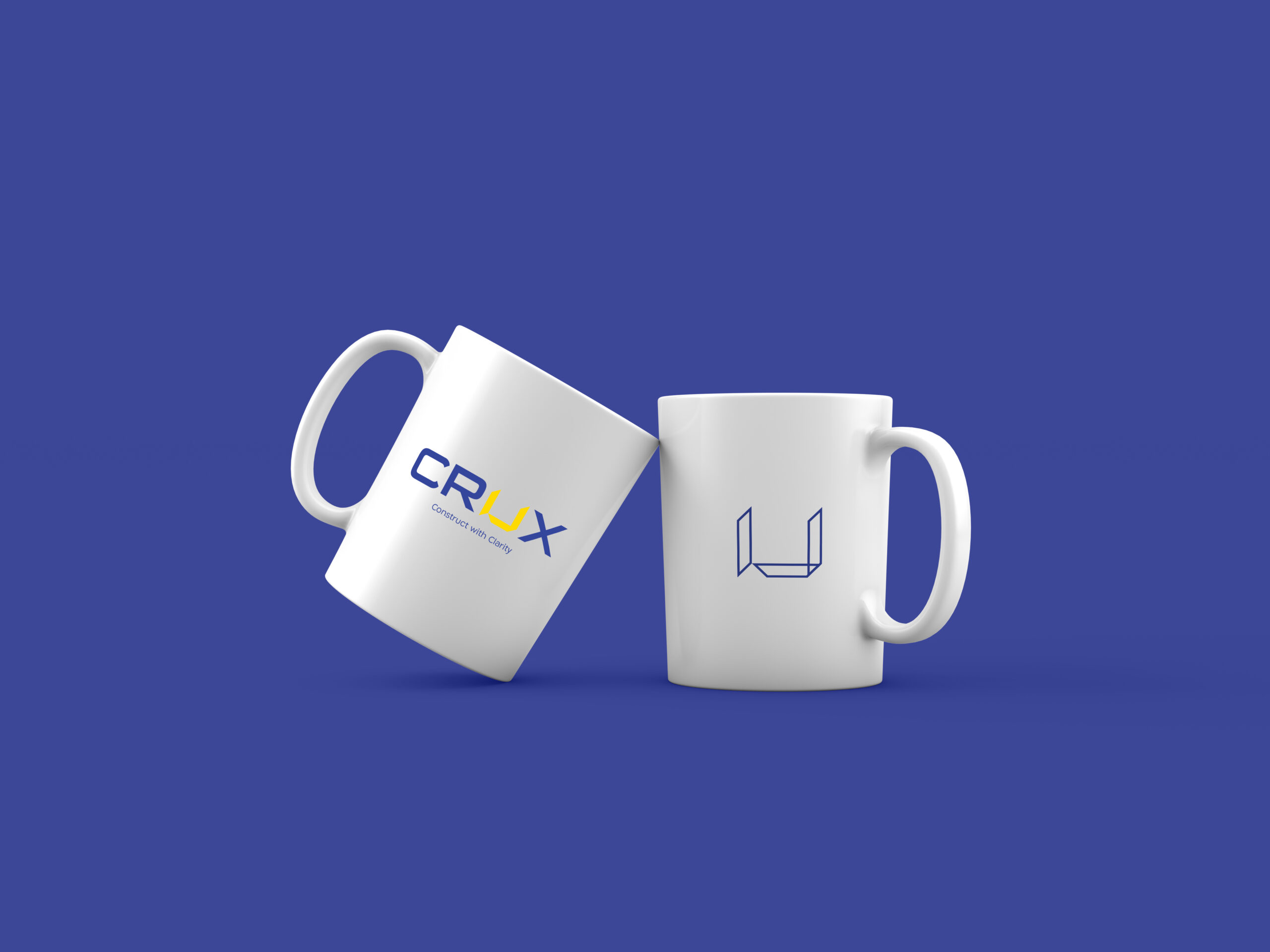
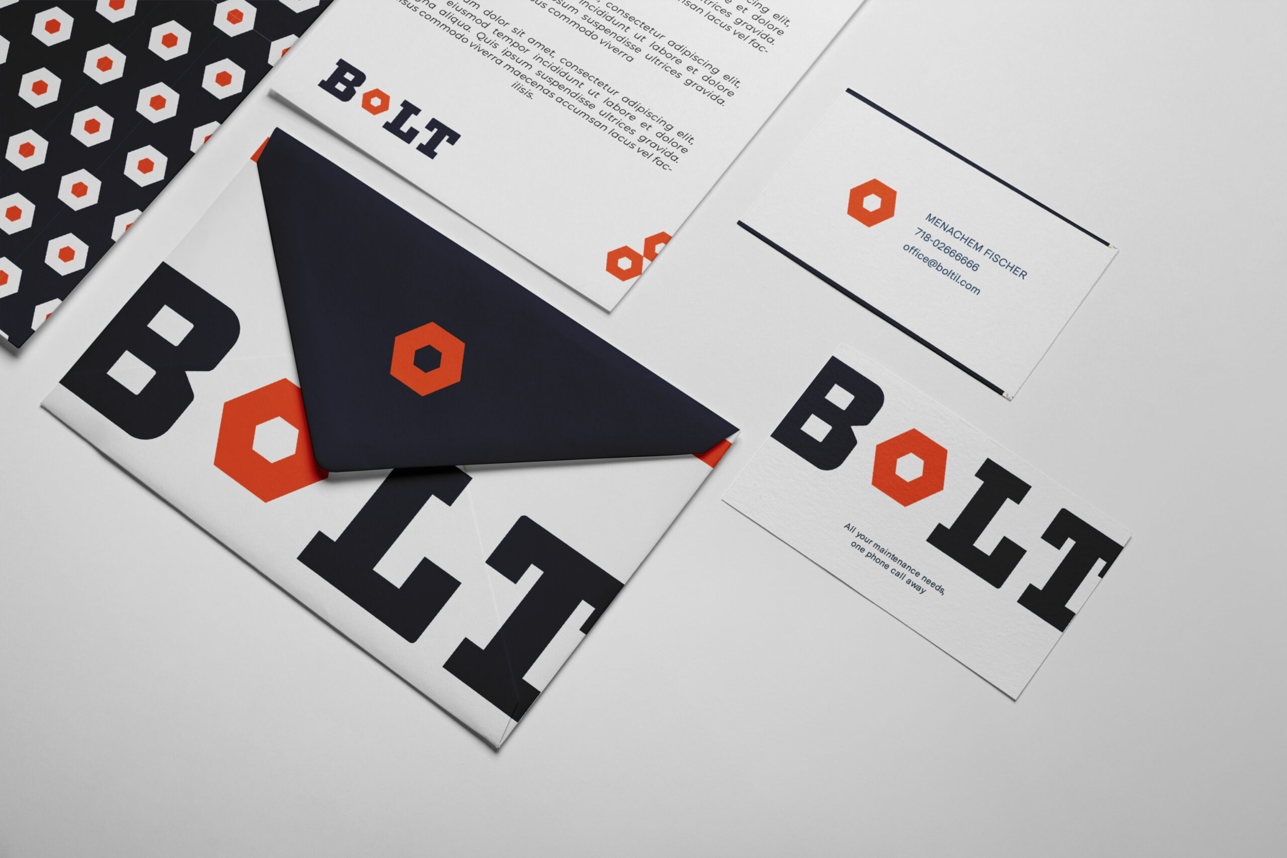
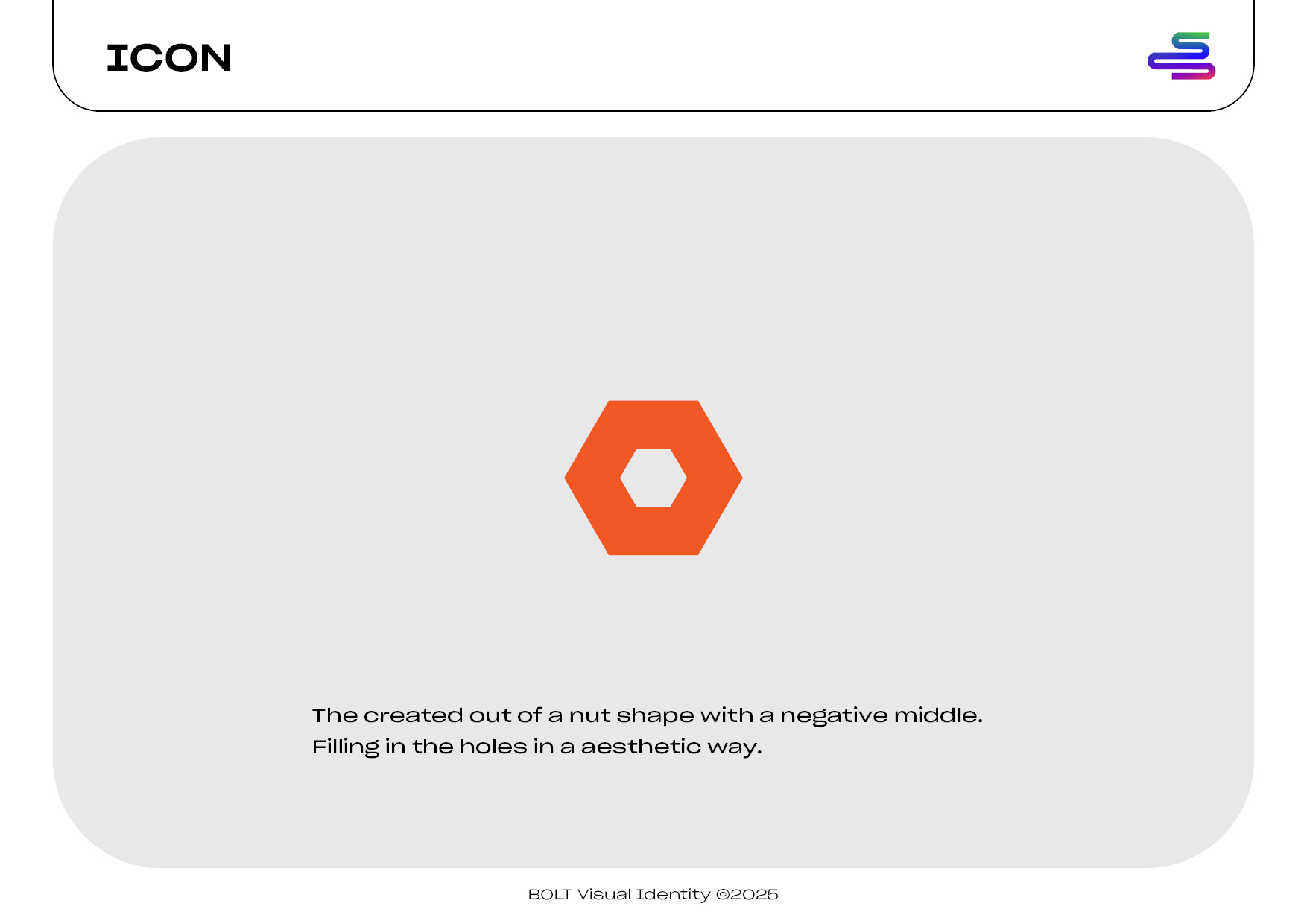
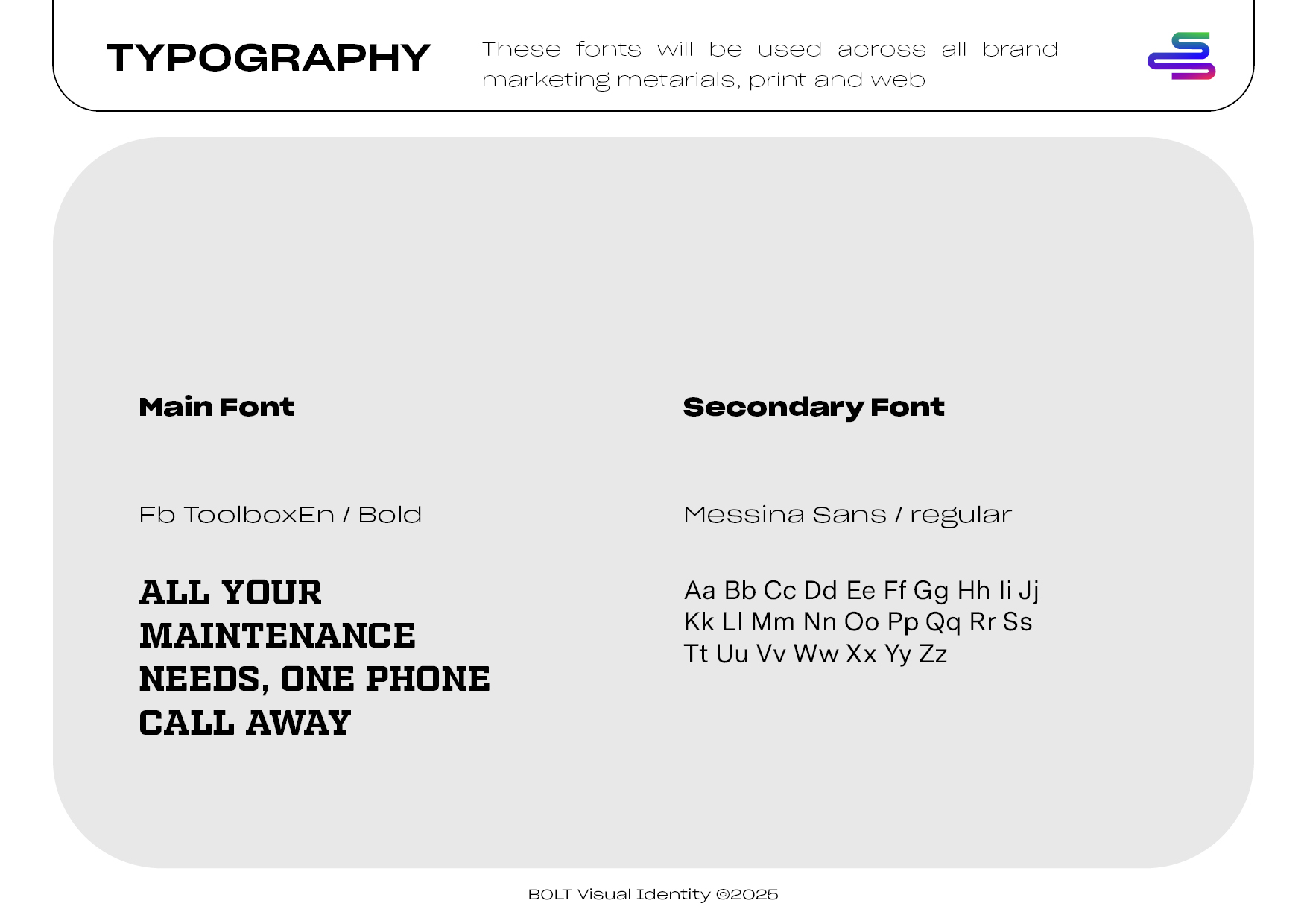
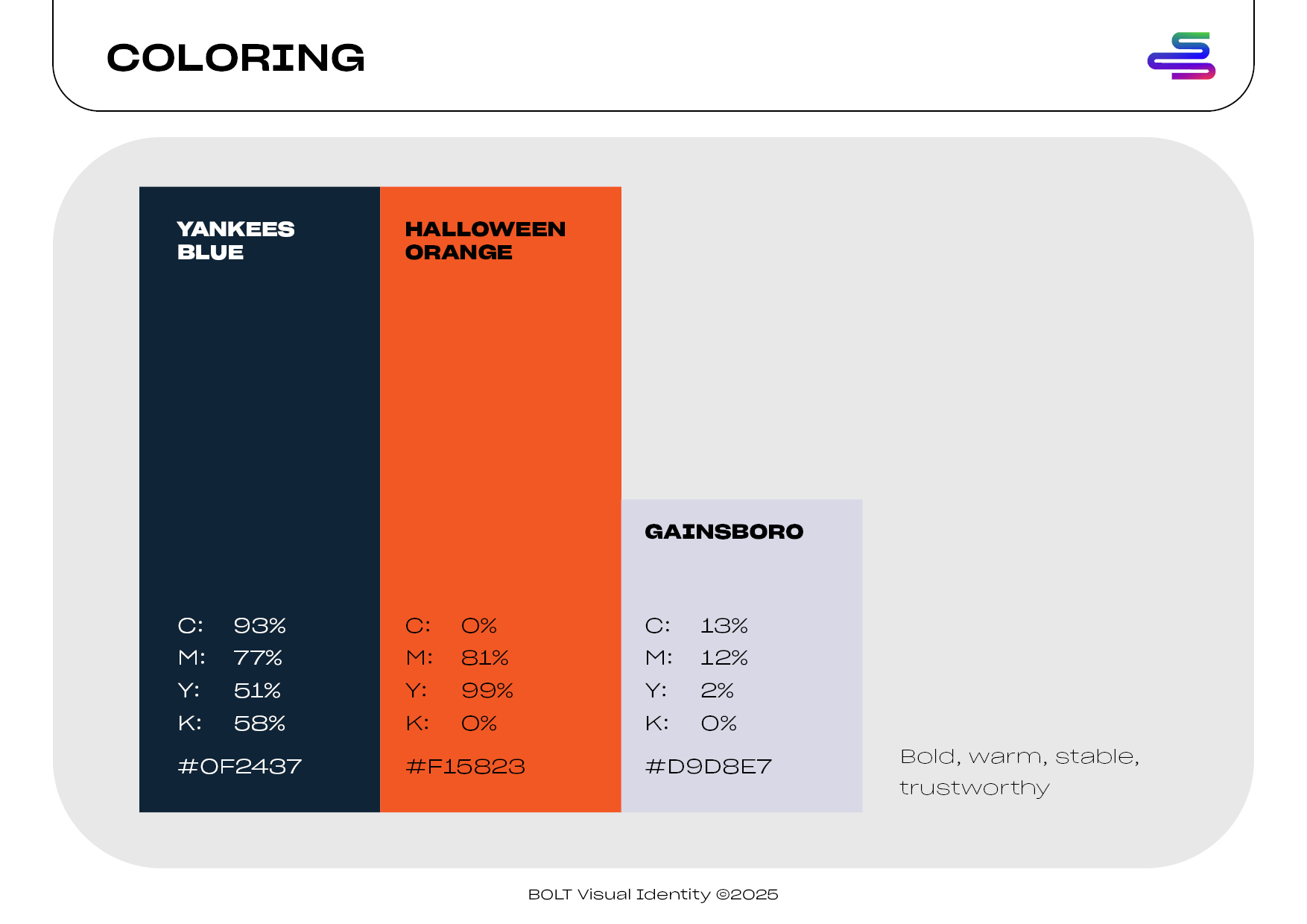
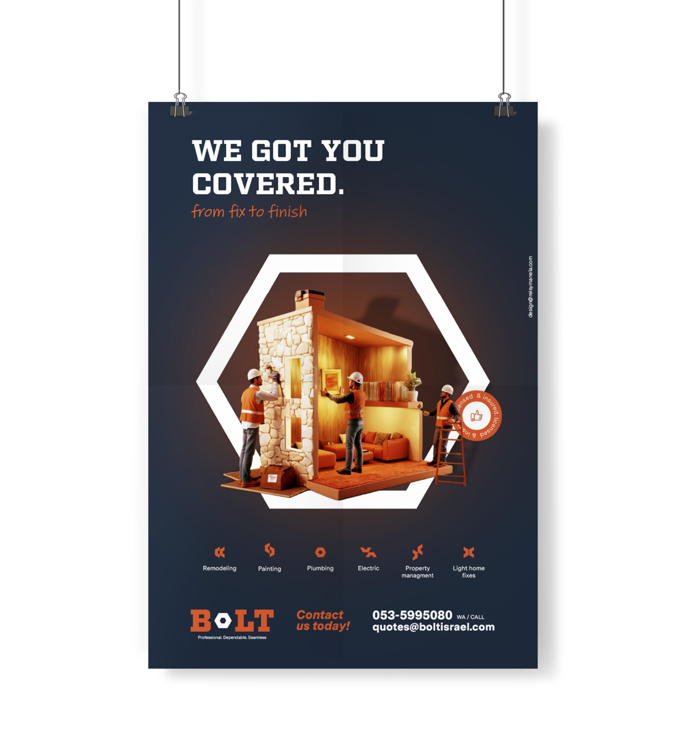
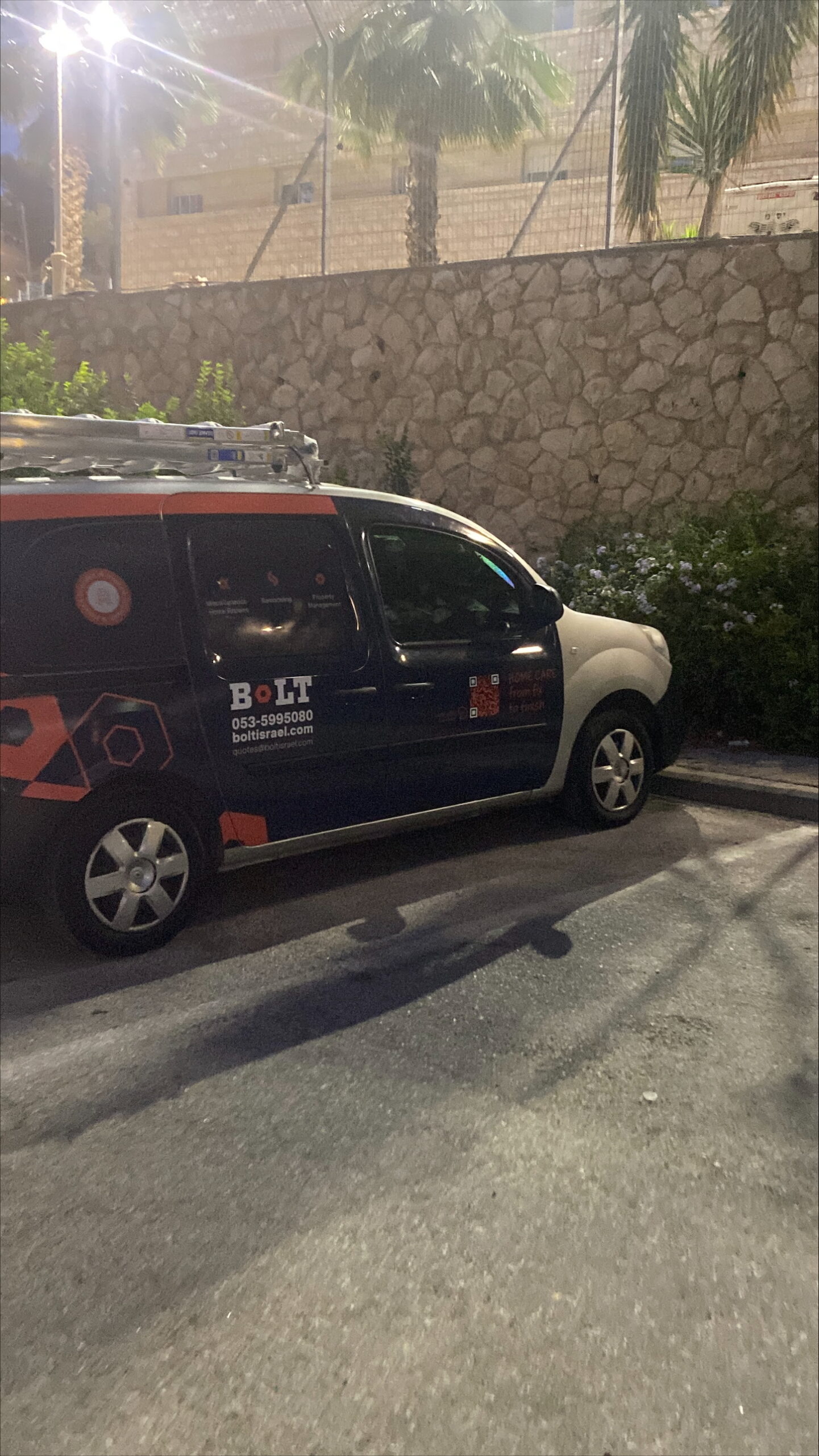
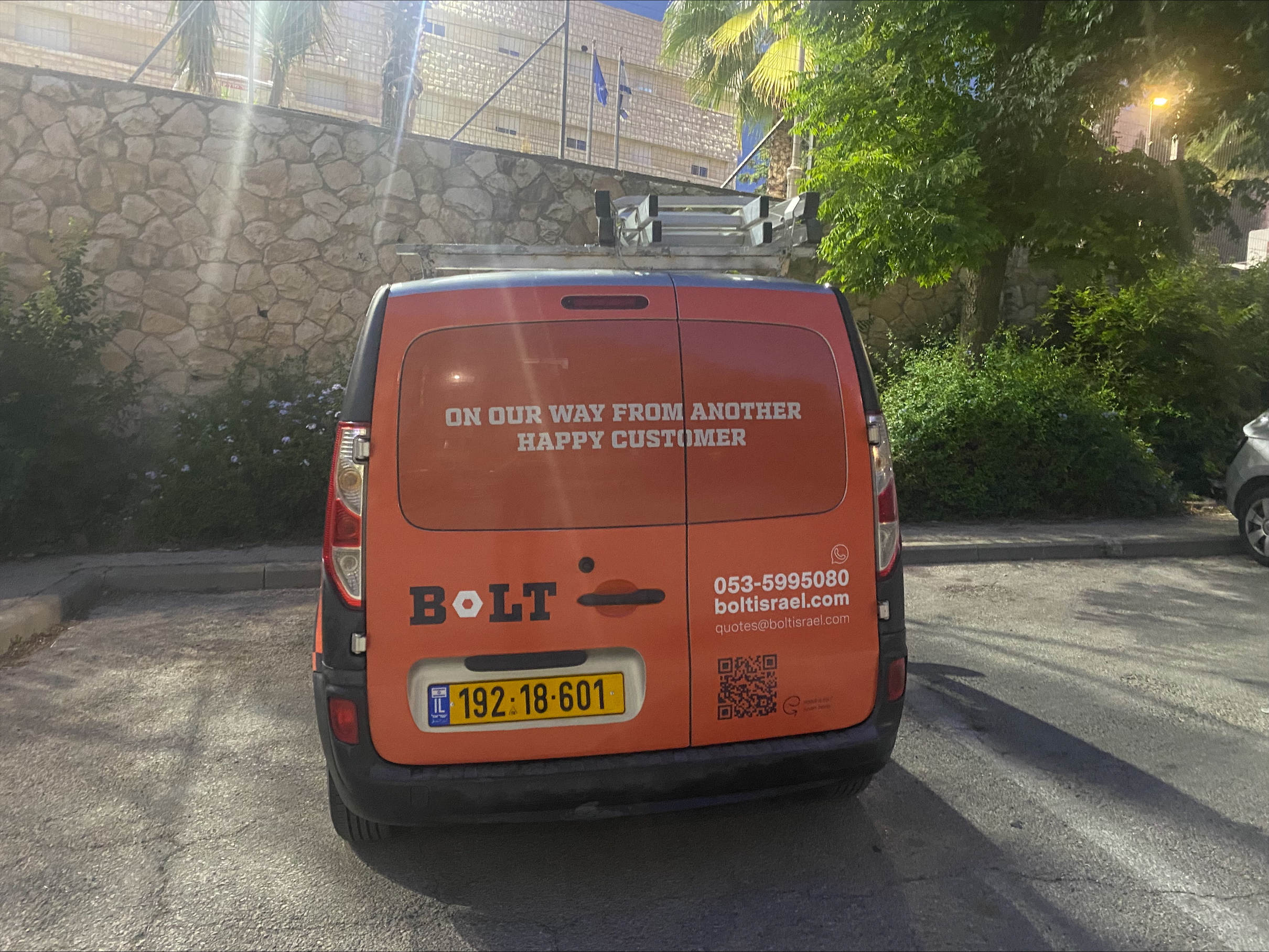
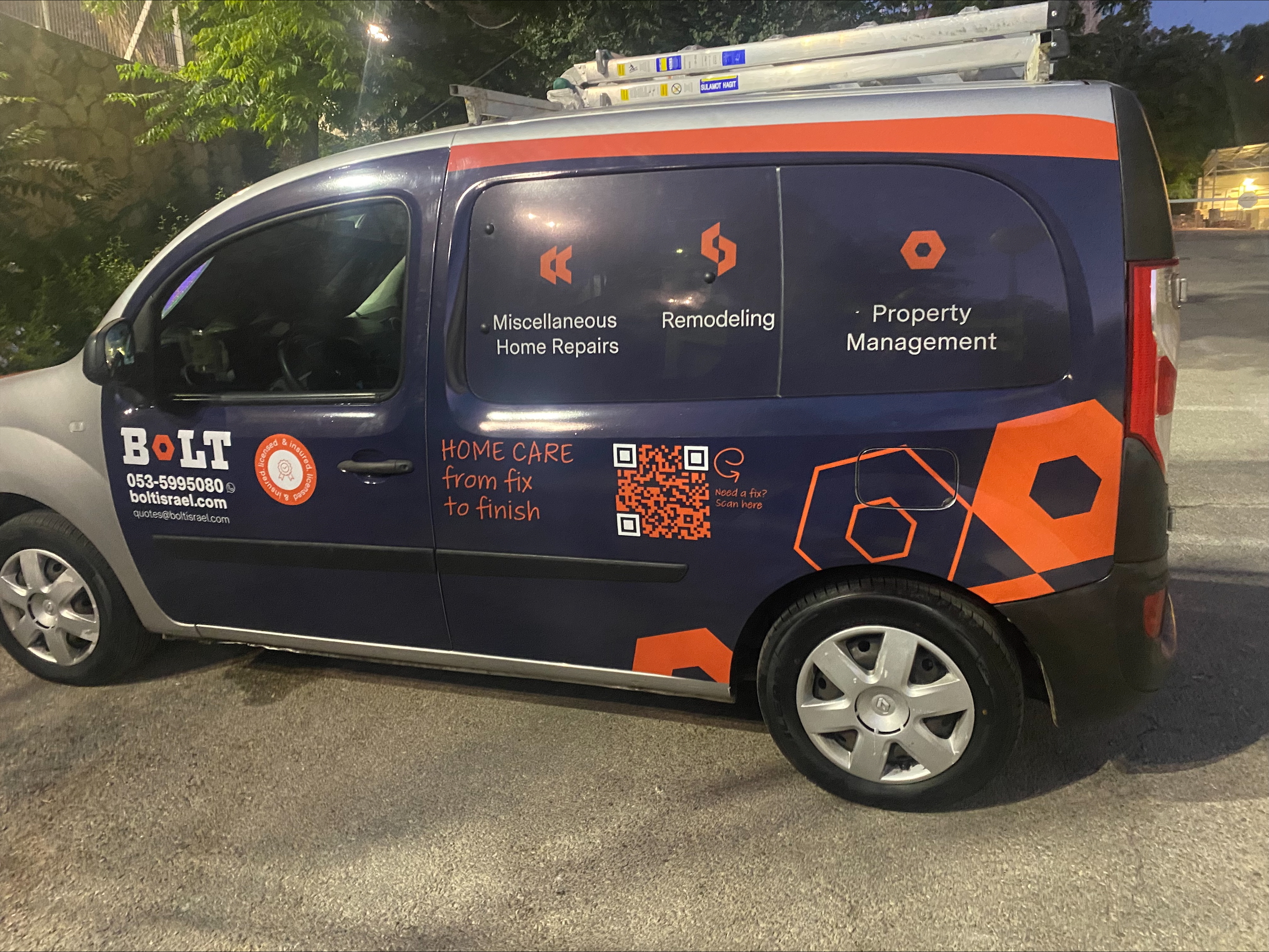
Anyone who’s lived in Israel for a while knows that service is not one of its society’s strong points. There’s so much else you can’t help but love here! This maintenance business needed to communicate precision and dependability from first glance. The hexagonal logo beyond being an actual bolt, immediately signals structure and reliability. Clean angles suggest exact measurements, tight tolerances, and no corners cut. The bold, industrial typography clearly tells you this isn’t a fly-by-night handyman operation. Using this geometric consistency across all touchpoints, from business cards to the poster’s dramatic hexagonal frame, creates visual confidence before you even read the copy. Deep navy establishes trustworthiness and bold, burnt orange accents add energy without compromising professionalism. In a market where customers expect delays and budget overruns, the style and look are the message: we actually show up and always over deliver. The geometry doesn’t just look good — it builds belief in their competence.
Services
Brand strategy
print design
ad campaign
Hear it from them
“Working with Mrs. Manela was a wonderful experience. She was easy to collaborate with, professional, and brought a strong mix of creativity and practical insight. Her understanding of the market really came through in the branding, ad design, and car wrap. The product was wonderful — thoughtful, sharp, and really suited to what we needed.”
The Bolt Team