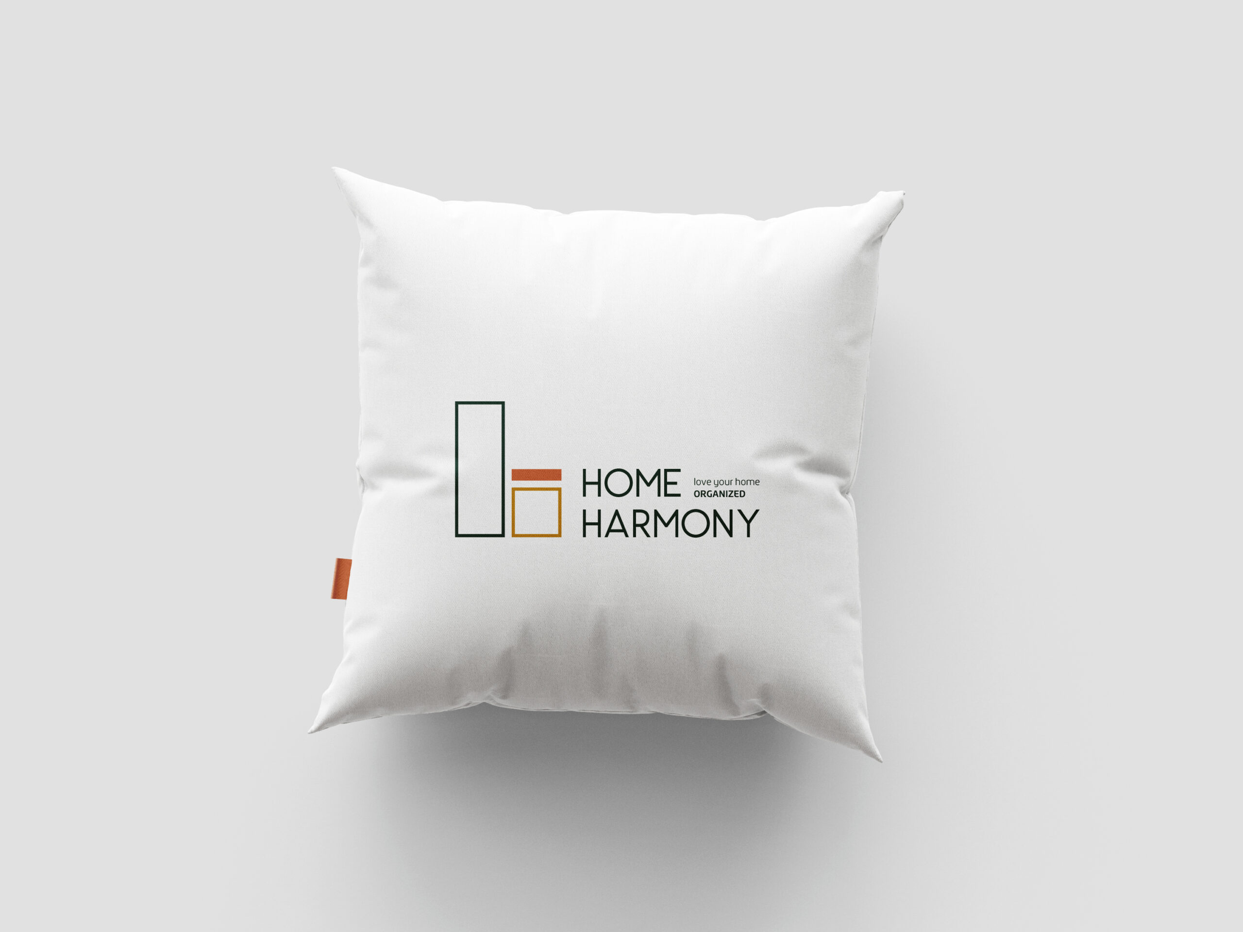
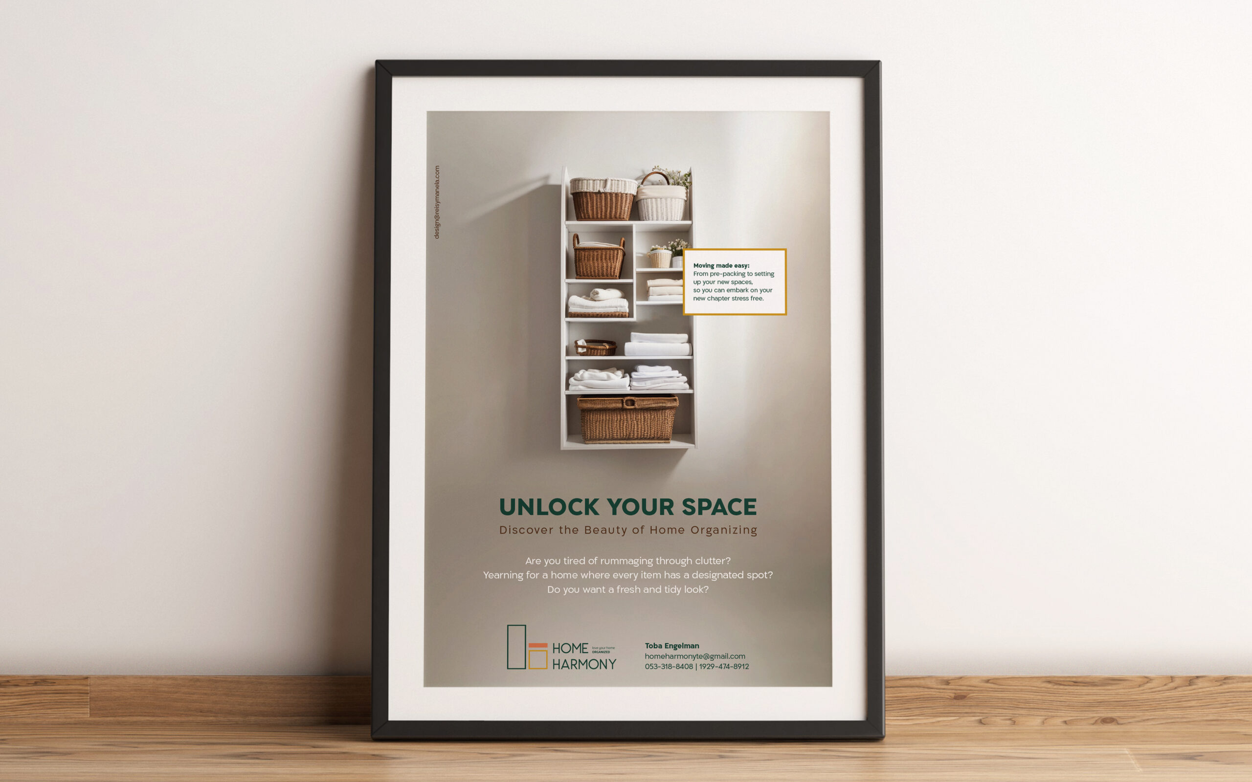
Leading with the outcome led me to the brand’s tidy, square look. I wanted to capture that sense of calm and control you get when everything has its place. Just looking at this logo gives me an illusion of that! Clean, stacked boxes that mirror organized storage while feeling modern and architectural. Warm terracotta and mustard hues welcome you in with a cozy, lived-in feeling rather than the sterile white that dominates this space. Images show you what realistic organization looks like – not Pinterest-perfect but genuinely achievable. Because let’s be honest, we want systems that work for real life, not a photo shoot. Here you see right away that it’s not about perfection and certainly not judgement. It’s learning to make it easy to love the space you call home!
Services
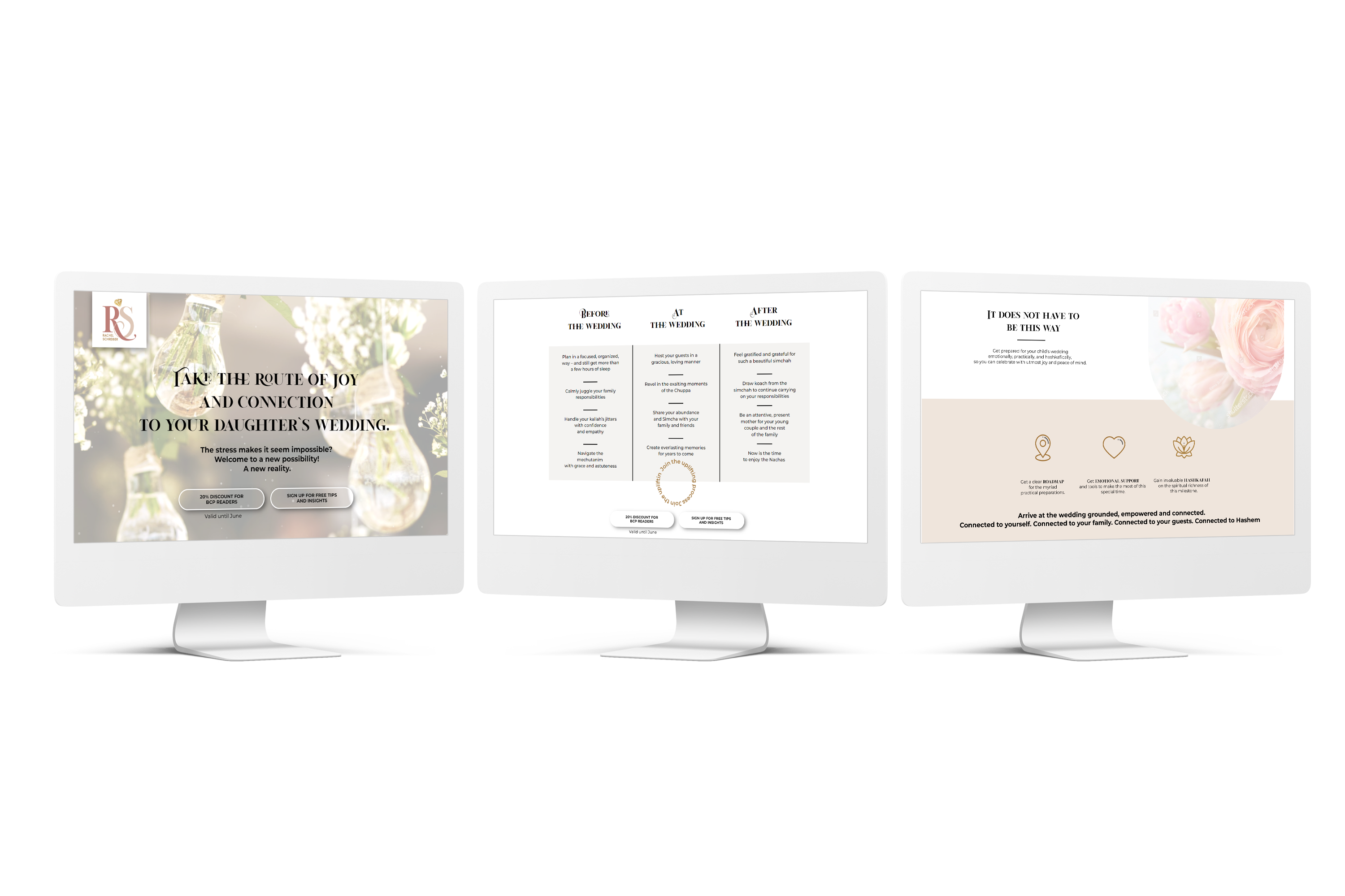
visual brand identity
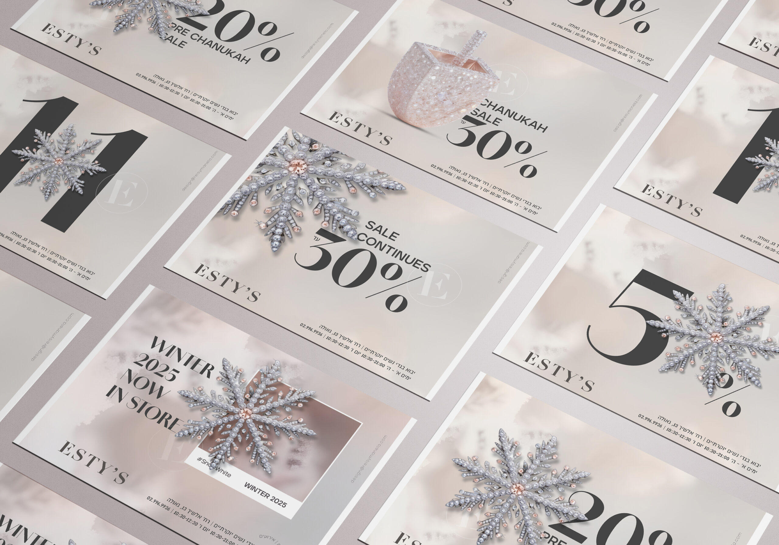
ad campaign
Hear it from them
“Incredibly talented and creative! Your artistry and attention to detail are exceptional, consistently bringing ideas to life with stunning designs.”
