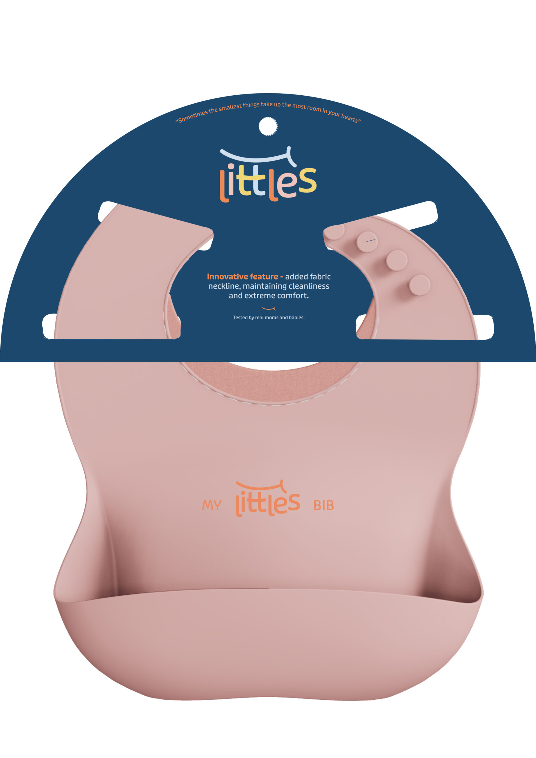
LITTLES
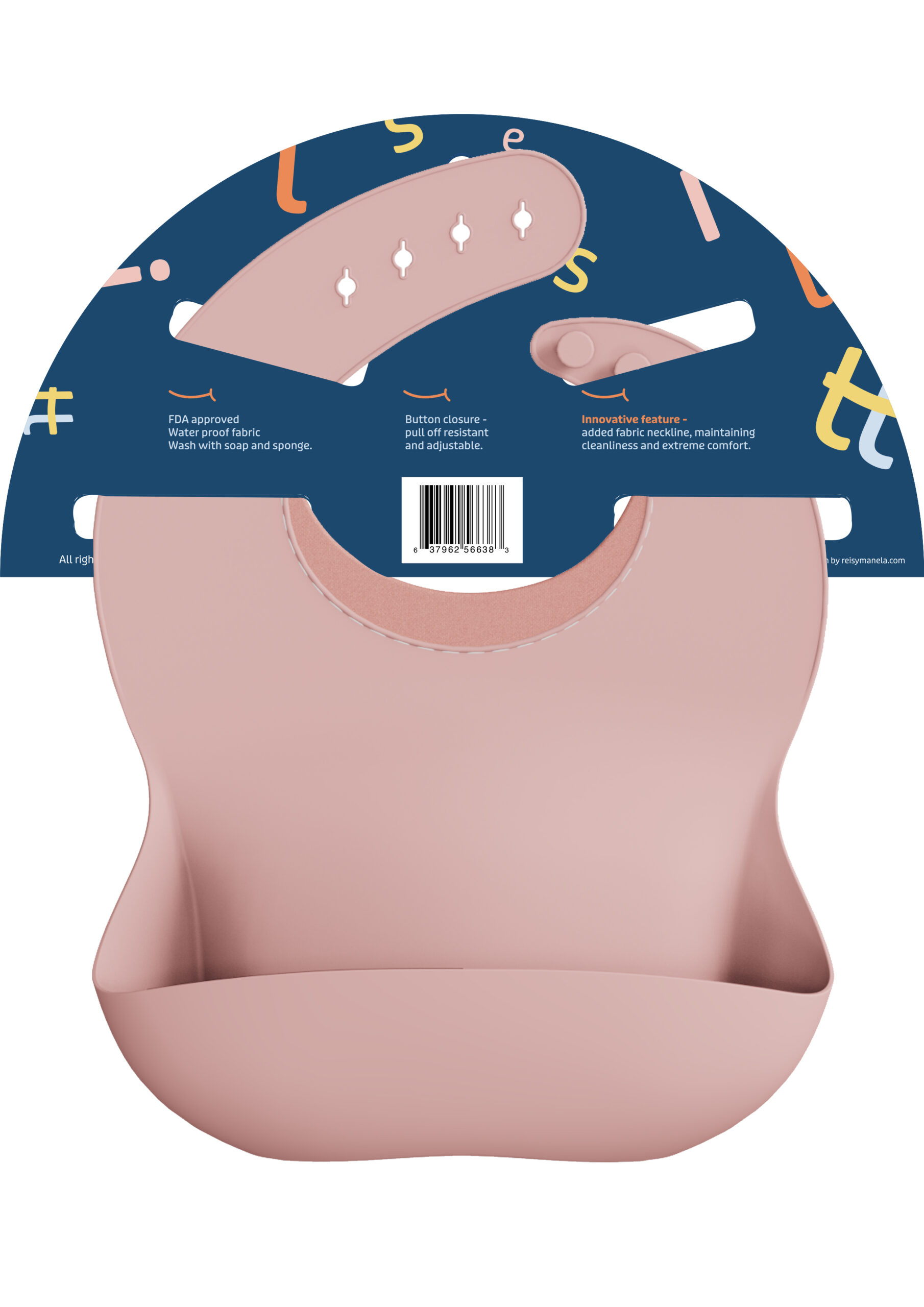
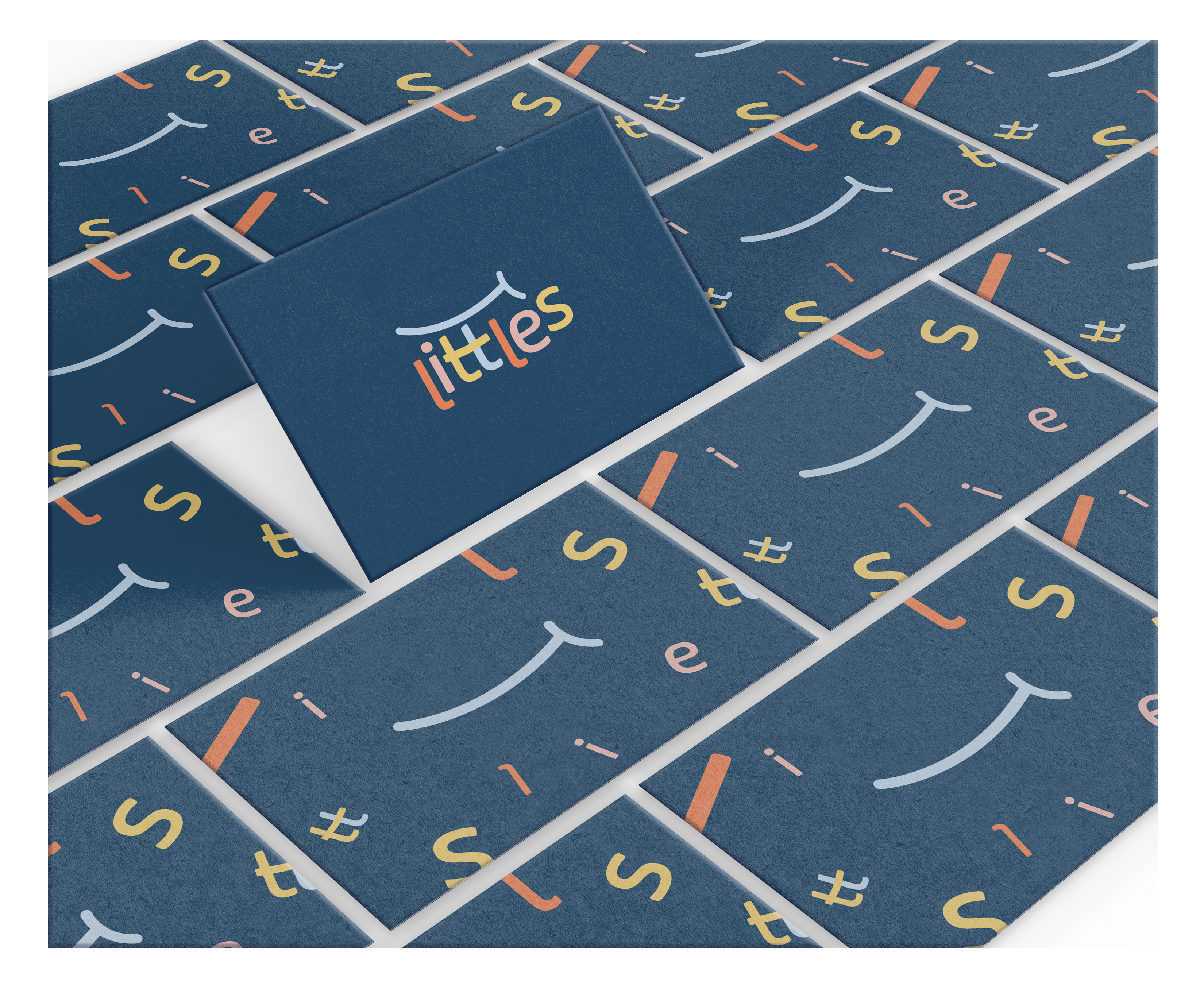
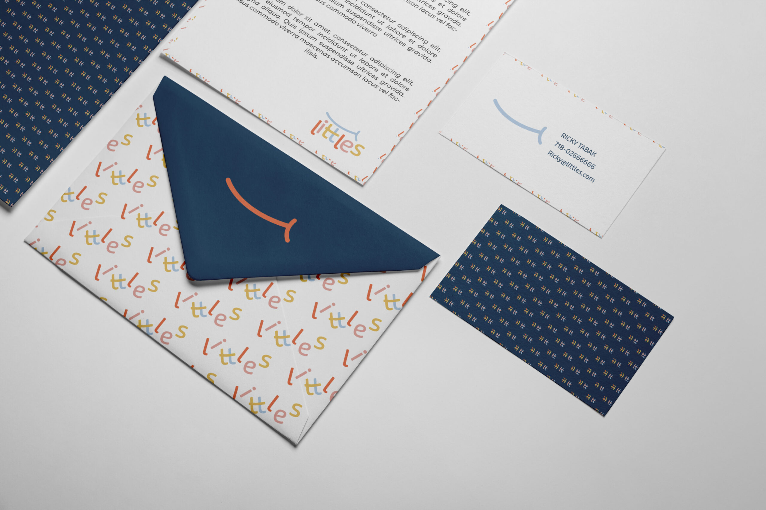
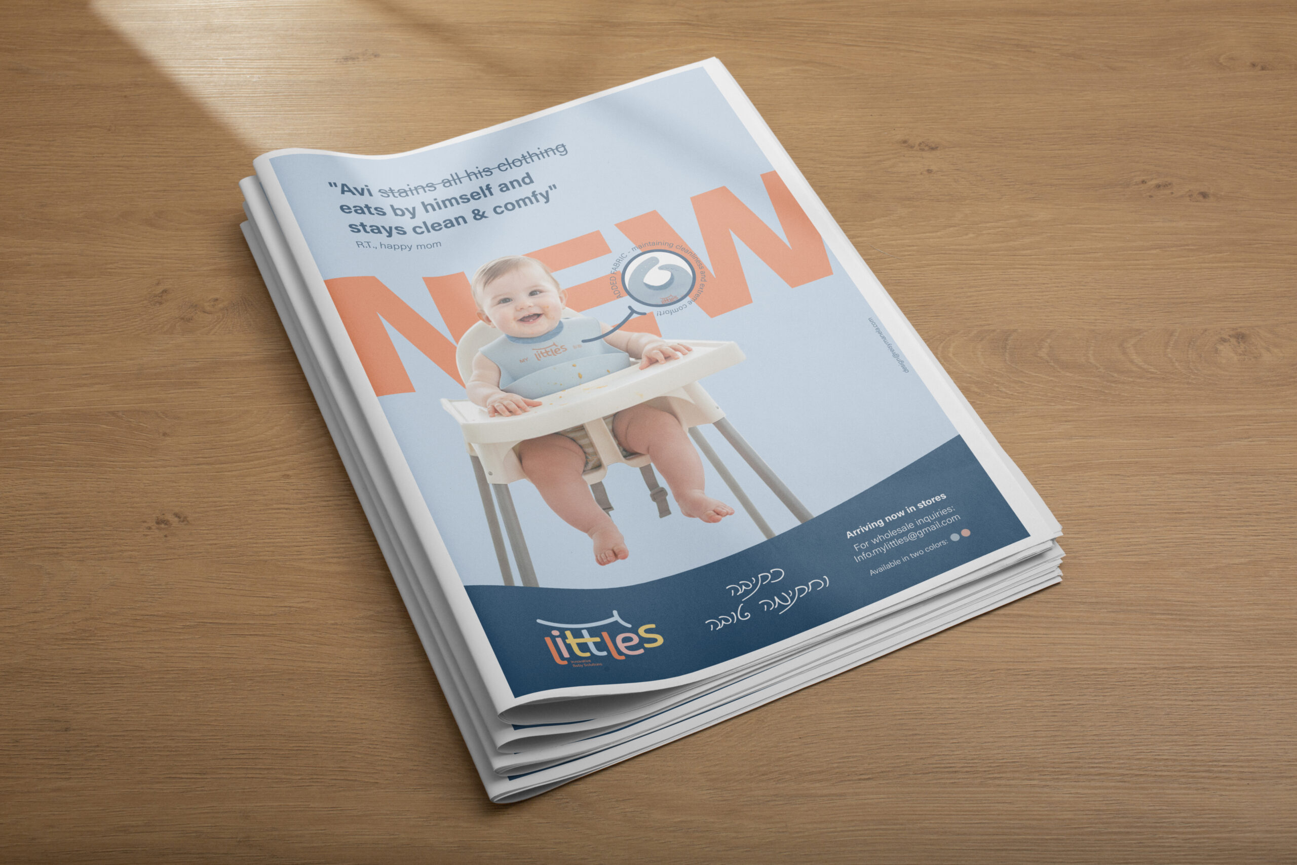
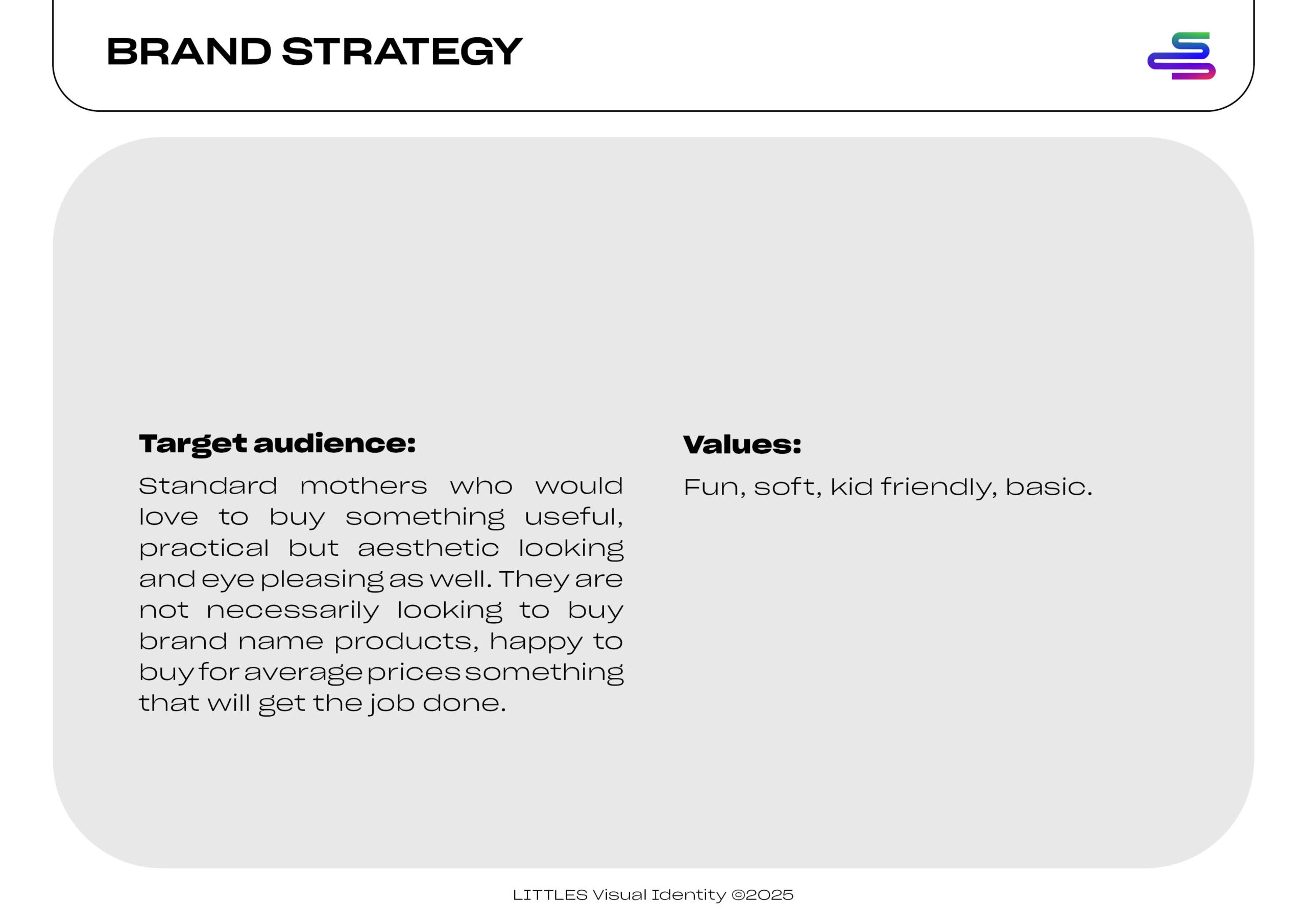
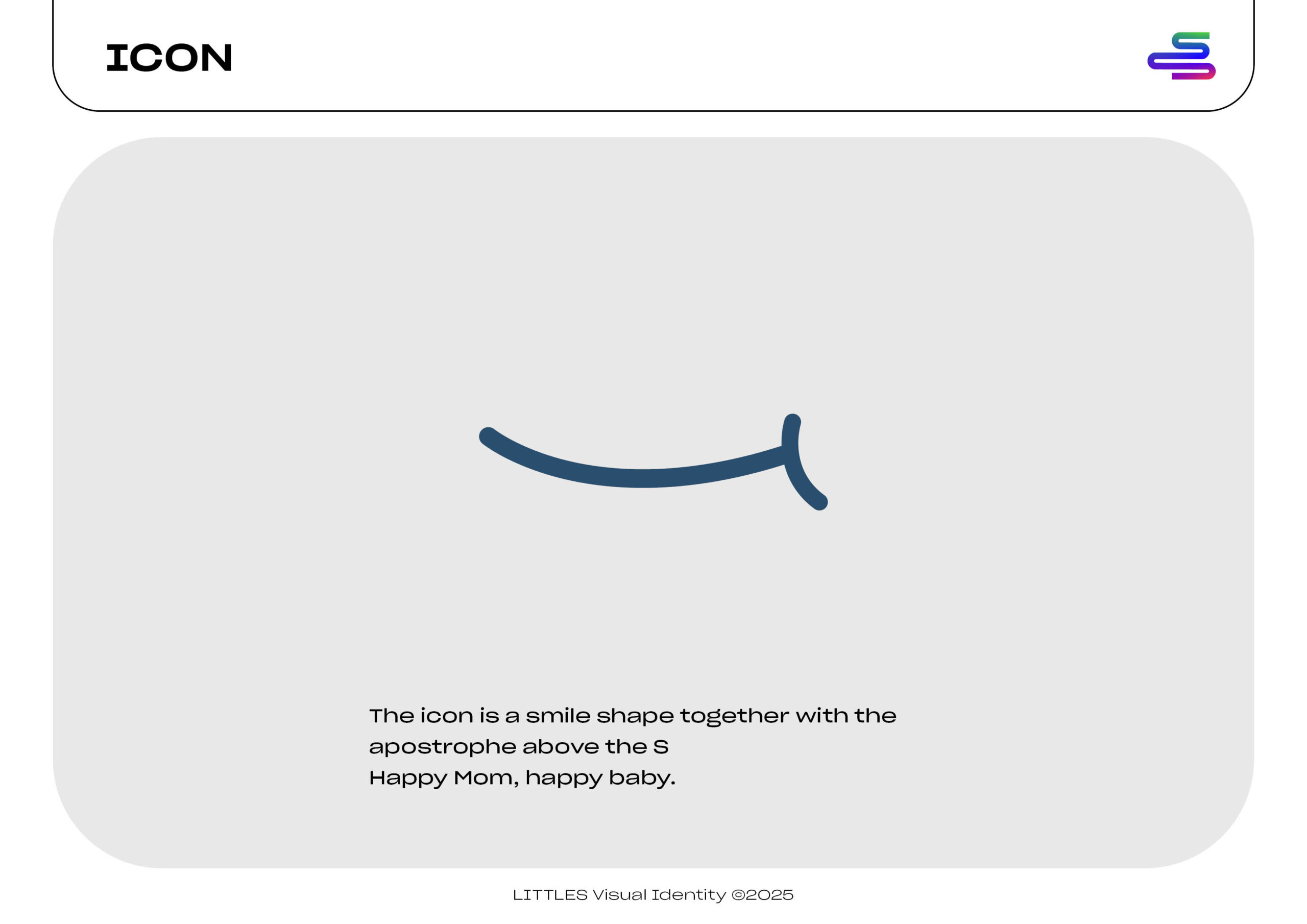
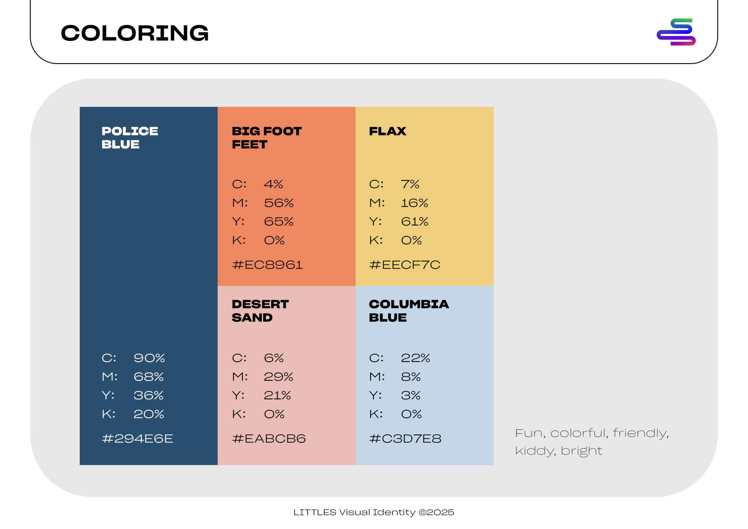
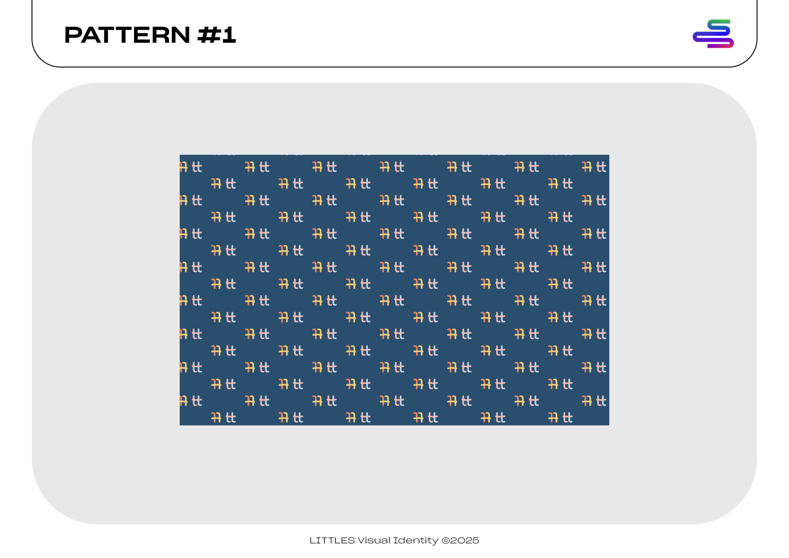
I’m not the only mom who moons over tiny newborn footies, right? Of course, this new practical baby bib had to have a cutesy vibe. The brand identity had to be flexible enough to support the expansion of the product line while remaining instantly recognizable. I chose a deep navy as the foundation color – going for the unexpected in the baby space dominated by pastels! – and paired it with that soft blush pink. The playful typography walks the line between childlike wonder and parental sophistication – after all, kids use the products but we know whose making the purchasing decisions. At least at this stage! The pattern system using abstract letters makes for immediate brand recognition even without the logo present. I’m excited to see this foundation extend into a full ecosystem of baby essentials.
Services
visual brand identity
print design
Hear it from them
“Working with Reisy was a smooth experience! She helped us gain clarity on where we were headed in our design strategy for our company. It was a pleasure working together.”
The Little’s Dreamland
