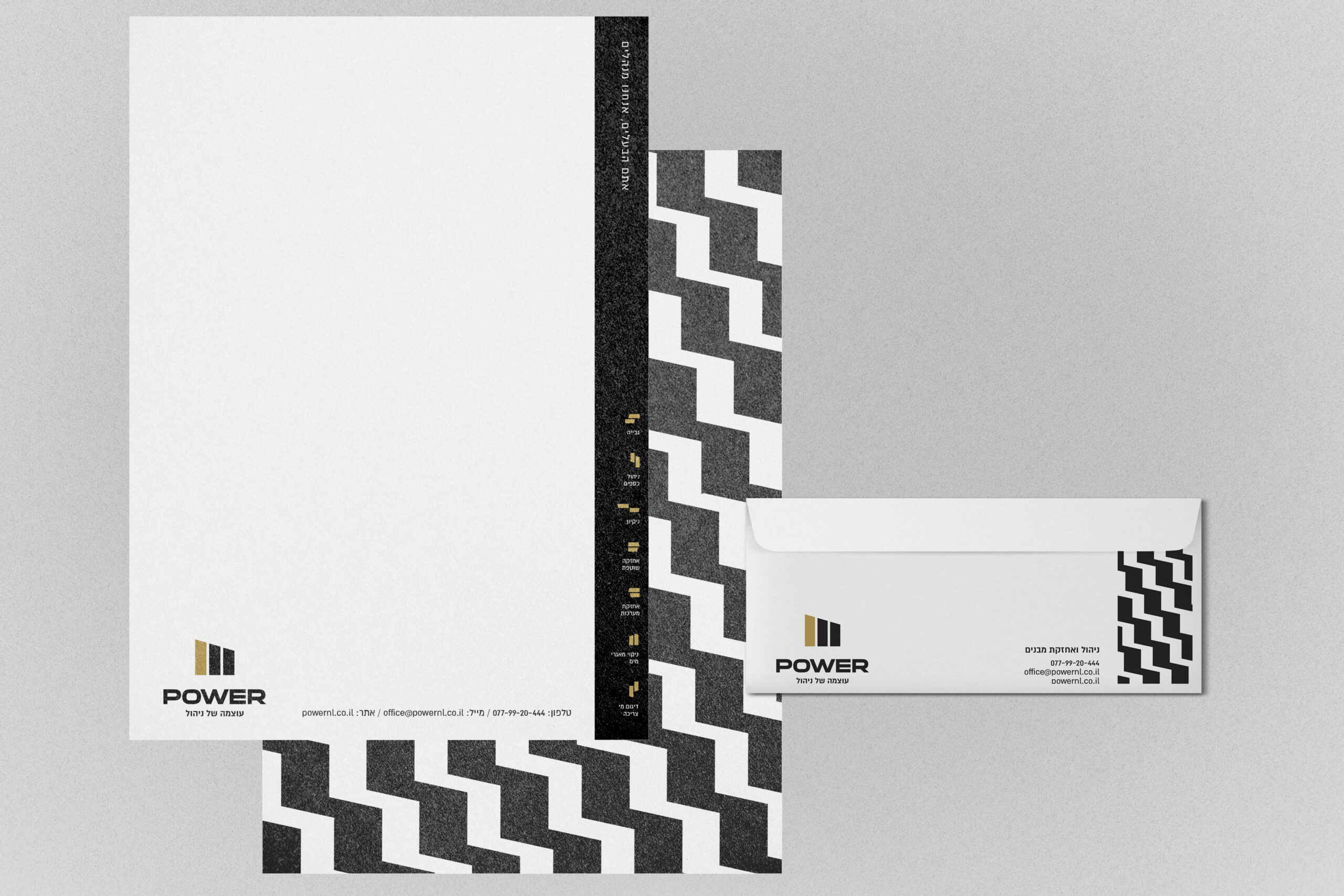
POWER
Power wanted to keep their existing logo’s essence while completely transforming how people perceive comprehensive property services. The question was, how will I make maintenance services feel premium without losing trustworthiness? I evolved their mark into something powerful – geometric elements suggesting structural integrity and upward momentum. The black, white, and gold palette distinguishes them from typical service providers while the zigzag pattern adds dynamic energy that reflects their proactive approach. The visual system works across everything from business cards to website, consistently communicating that this is the sophisticated choice for property management. The website reinforces their transparency promise with clean layouts that make complex services feel approachable. This rebrand transformed Power from “just another service company” into the obvious choice for discerning property owners. It truly powered them up!
Hear it from them
“We got outstanding service – you went above and beyond, going into every tiny detail to give us a perfect finished product!”
Power Group

