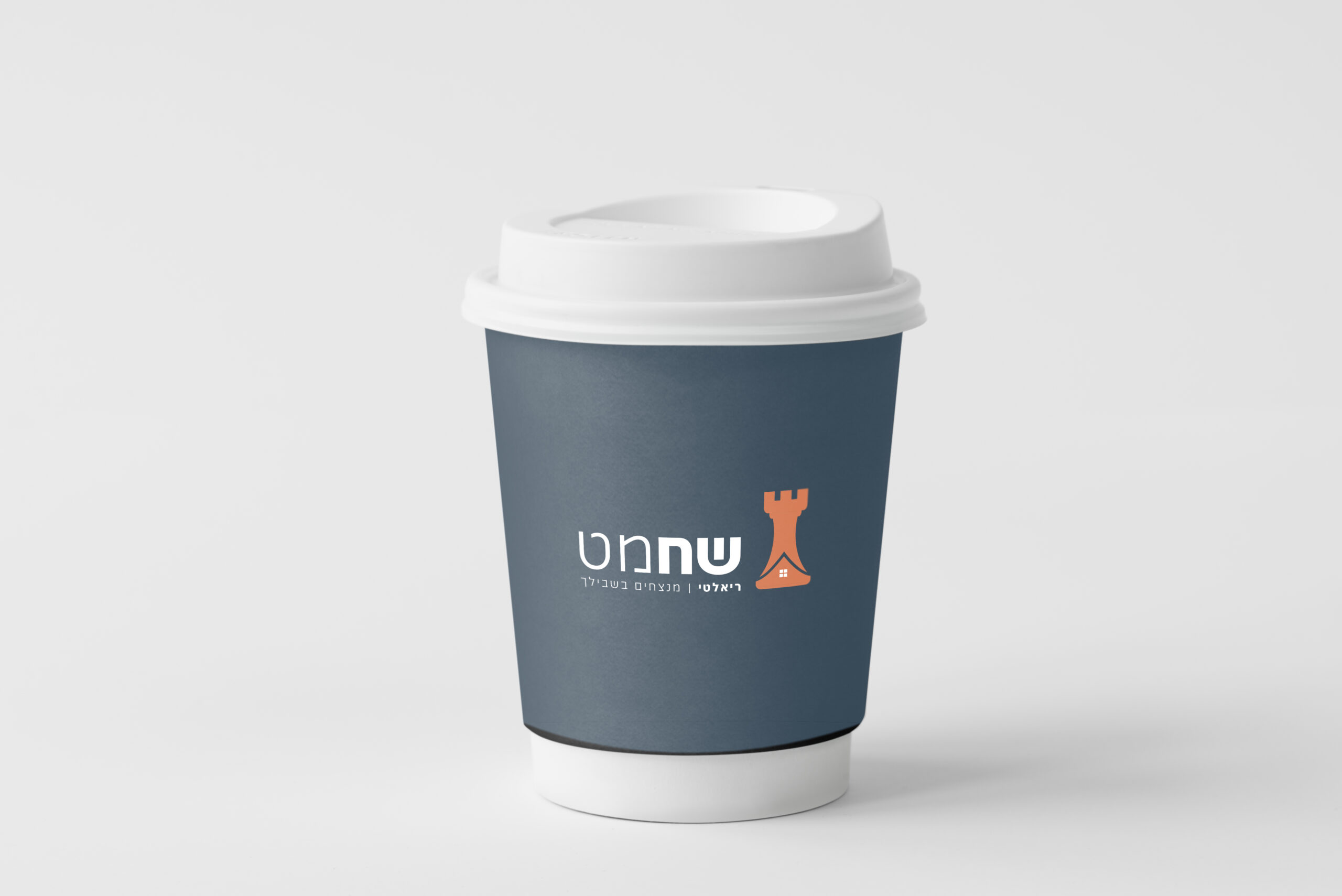
SHACHMAT REALITY
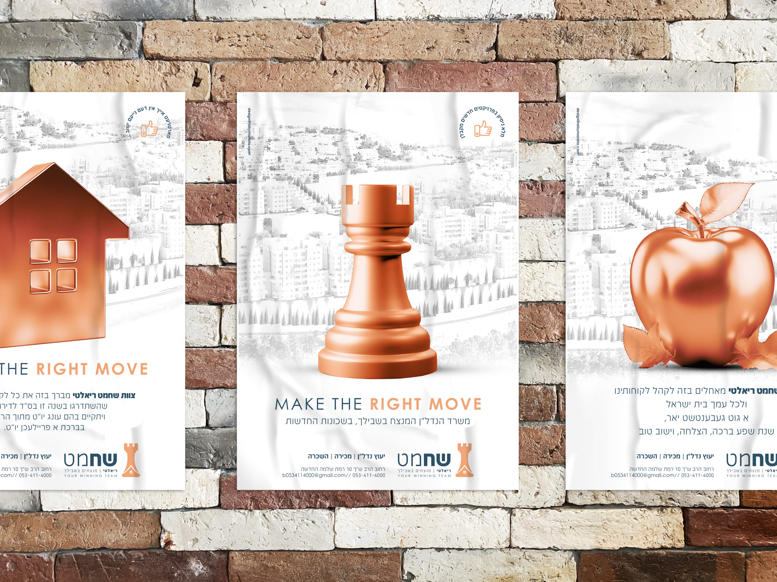
It’s a tough market dominated by established players. If you didn’t guess yet, we’re talking about real estate in Jerusalem! Building the brand around chess strategy, the rook acts as the perfect metaphor for real estate decisions that require wise, thought-out moves. The warm copper color palette goes for a premium yet approachable level and is standout material from typical real estate aesthetics. Each marketing piece creates a cohesive narrative across touchpoints with the Jerusalem skyline backdrop centering everything around the coveted location. The approach elevates the conversation beyond just buying and selling. It becomes clear that this is a strategic partner who thinks several moves ahead and connects with the diverse Jerusalem market.
Services
visual brand identity
print design
Hear it from them
“From start to finish says it all! Your services became the foundation for our successful office development and branding. Focused, genuine service that exceeded all expectations.”
Shahamat Realty
