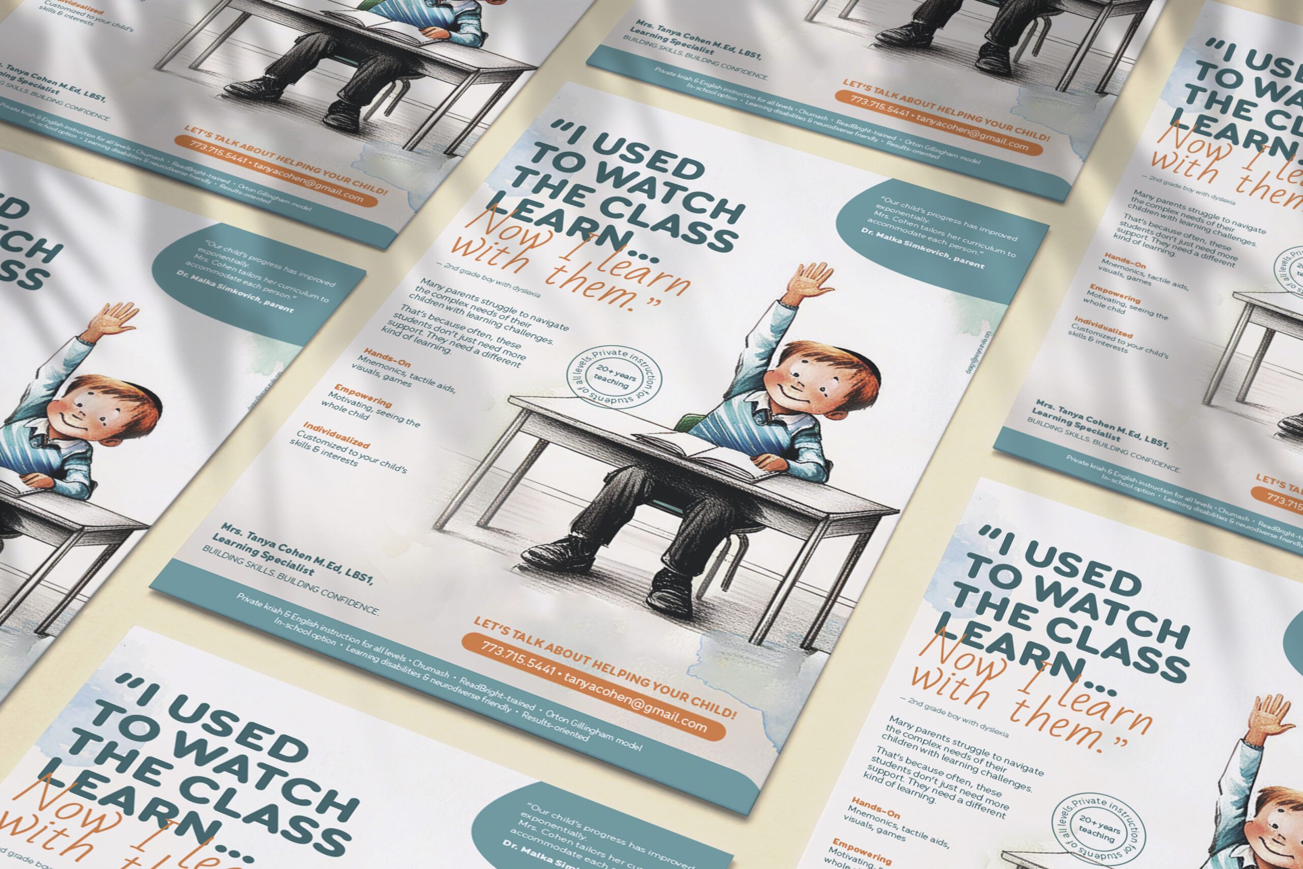
How do you make someone the obvious choice for parents seeking specialized learning assistance? Hand-drawn style makes for a child-friendly atmosphere and the teal+orange palette is a vibrant allusion to optimism and enthusiasm. Together with the approachable yet authoritative copy it talks professional plus supportive to concerned parents. I put emphasis on clean typography hierarchy to guide the eye through key information and used rounded design elements to soften the feel. This design successfully bridges the gap between institutional authority and personal connection, helping Tanya establish her independent practice. Can you see how the design gives you a vibe that she is a trustworthy pro who genuinely cares about children’s learning journeys?
Services
ad campaign
Hear it from them
“I am getting such positive feedback about the ad you made for me. Everyone loves it! You really captured my brand’s message. As a friend so eloquently said, ‘the ad is you’.”
