YES OR NO
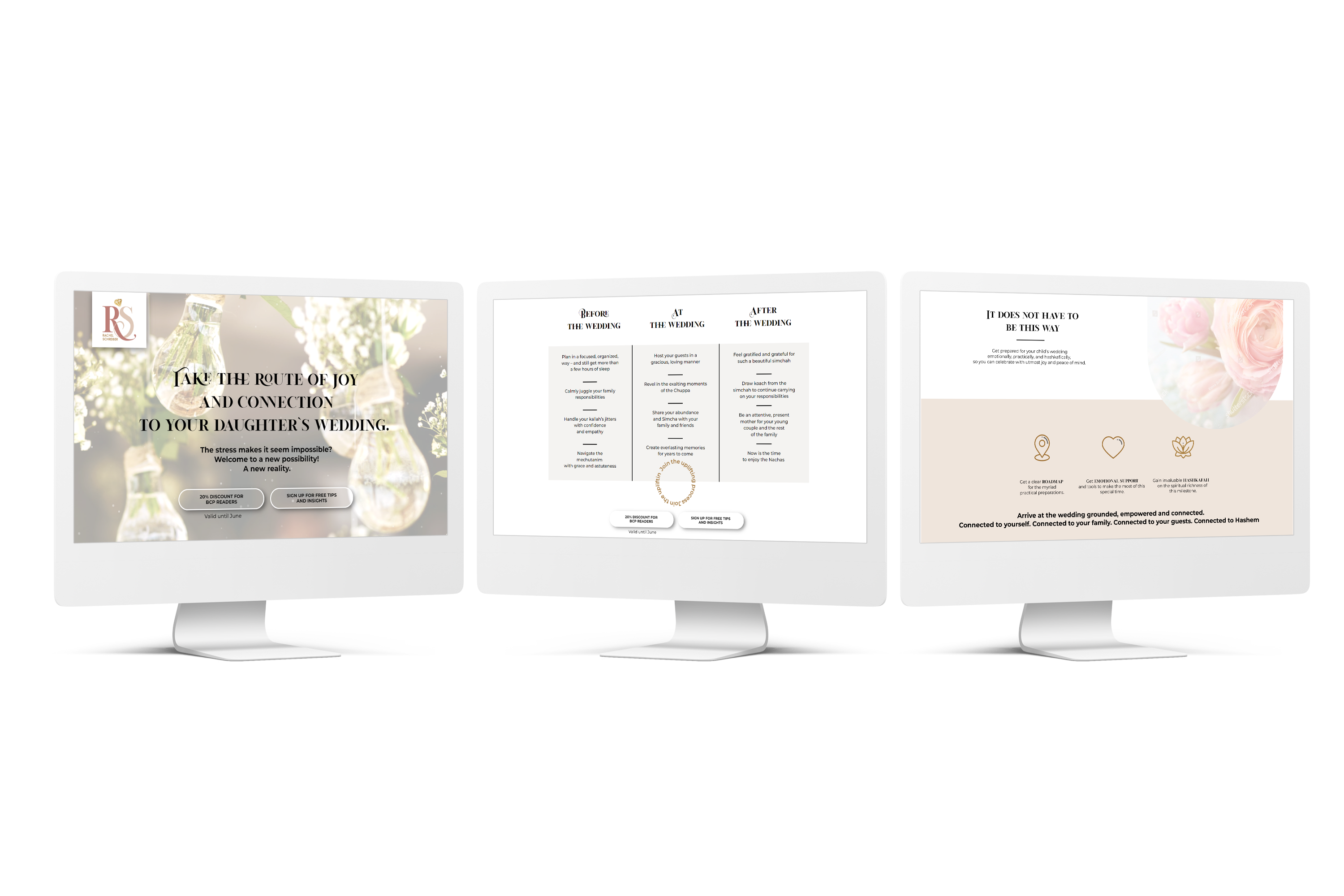
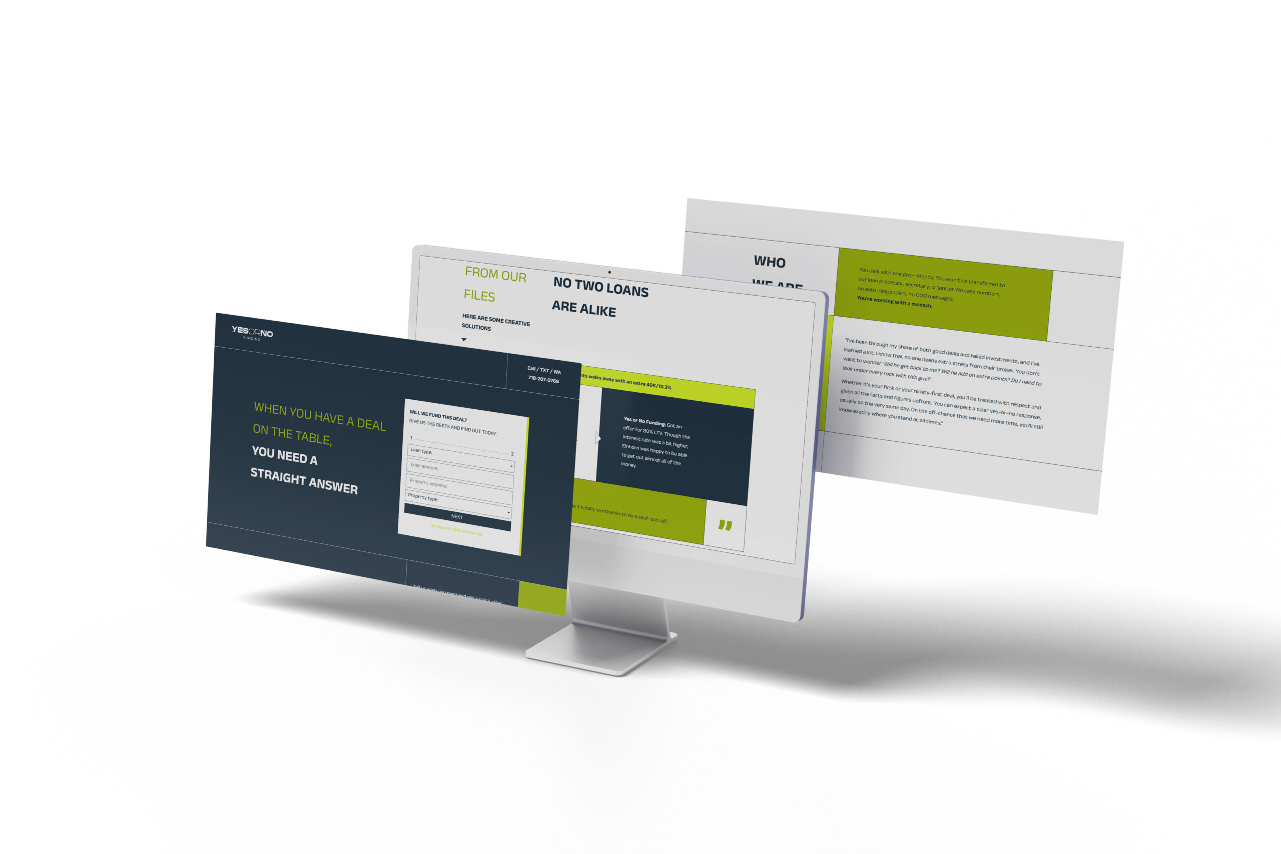
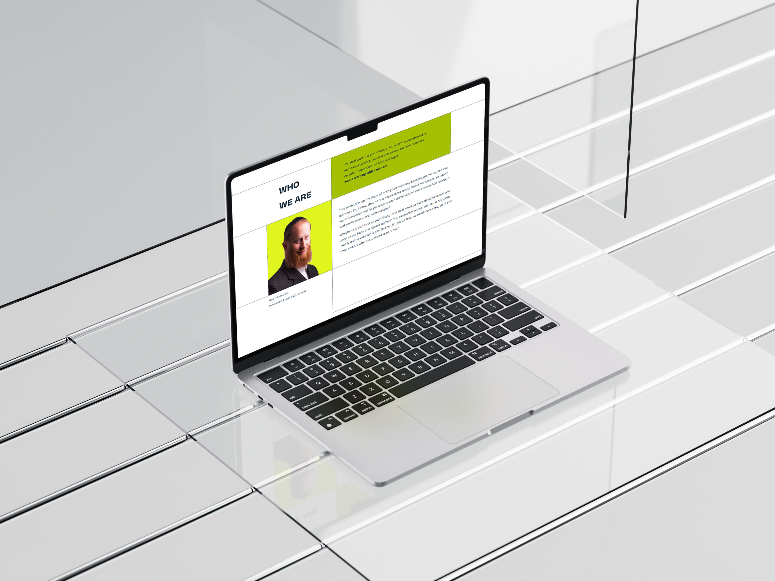
Working with the client’s no-stock-photos constraint and no budget for a shoot, I needed to establish hierarchy and convey credibility through pure design fundamentals. Give me a design challenge like this more often! Going for a clean, minimal layout flows naturally while building trust through structured information presentation. The triangular arrow elements from the logo become functional wayfinding tools throughout the design — guiding users through the narrative. Bold typography creates clear visual separation and consistent formatting makes it all easily scannable. The professional aesthetic reinforces expertise while the straightforward layout mirrors the direct, no-nonsense approach to funding solutions. As a whole, it underscores the message: this is serious, professional service focused on results rather than flashy marketing. The results prove how something so simple looking needs to include lots of process and deep thought in the design!
Hear it from them
“When I needed a site for a brand close to my heart, I chose Reisy Manela for her unconventional, untemplated, unmatched creative design talent. She did an incredible job, as I expected. With few brand visuals and no stock photos to work with, she somehow created a sharp, professional website that is fully responsive on multiple devices. She also followed up on any loose ends until every detail was wrapped up — graciously. It’s an absolute pleasure to work with Reisy. I highly recommend her!”
Nechy Sampson, Owl Copy
